
Many of you will no doubt remember RAISE reports, and I suspect few will look back on them with any degree of fondness. Newer governors can consider themselves fortunate that they never had to endure these monster documents, but it’s worth understanding their legacy. Even now, ten years on from their demise, there is no romantic, rose-tinted nostalgia for RAISE. Certainly not from us here at Insight Inform.
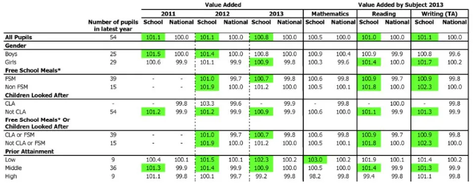
By peak RAISE – I’m guessing around 2011/12 – the reports were over 100 pages long. 100 pages of the same data presented in different ways. And even the smallest primary schools did not escape. Every measure for every subject broken down by every sub-group of pupils, sometimes presented in charts, sometimes as tables, and sometimes as ‘stick men’. There were around 20 pages devoted to value-added (VA), which no one understood and everyone ignored unless the scores turned blue (the old red) or green. You may recall that the average VA score for a primary school was 100. For a secondary school it was 1000. Nobody knew why. We just looked at the next 20 pages devoted to the made up levels of progress measures, which often told a completely different story.
Then RAISE went away and spent the summer at a spa retreat, and when it returned it was lighter. The reports were now a relatively svelte 63 pages, and the DfE very helpfully printed a large blue G at the top of each page that should be of interest to school governors.
There was a G on pretty much every page.
And it’s probably governor training that evokes the most painful RAISE-related memories. Not a criticism of governors – I am one – but who wants to sit in a cold school hall on a tiny chair on a dark November night with the heating off and coat, hat and gloves on, to go through 103 pages of binary? RAISE training sessions for governors were the education equivalent of a speed awareness course.
The problems with RAISE were twofold: the sheer size of the document; and the illusion of accuracy that it conveyed. You felt obliged to go through it all, and you trusted the data told you something important that should be acted upon. If you give someone an official report filled with data, they’re probably going to take it seriously, especially when they know that the government’s inspectors will be looking at the same document. But RAISE was not a surgeon’s scalpel; it was a blunt instrument. The data contained in a RAISE report was noisy; and the smaller the school, the noisier the data became. Who knows how many RAISE-inspired false conclusions have found their way into school development plans?
It’s been nearly a decade since the last report was published, but RAISE casts a long shadow; and its legacy of ‘big is better’ still influences what is reported to audiences such as governors. The system that replaced RAISE – Analyse School Performance (ASP) – includes a 37-page-long report that repeats many of the same mistakes by breaking the data down into numerous pupil groups, regardless of the size of the school; and schools, LAs, and trusts will often emulate this approach in their own reports. But no one should be comparing the attainment of four pupils on free-school meals to that of 450,000 ‘non-disadvantaged’ pupils nationally. Or worse, the academic performance of pupils with SEND to those without SEND.
Developed alongside ASP is Ofsted’s own report on school performance, the Inspection Data Summary Report (IDSR); and its evolution is interesting. In 2017, the IDSR was 22 pages long. A year later it had halved in size, and by 2019 the report had been trimmed further to a mere 5 or 6 pages. So, what happened? A speech made by then HMCI, Amanda Spielman, in 2018 is revealing. In it, she stated:
“Nor do I believe there is merit in trying to look at every individual sub-group of pupils at the school level. It is very important that we monitor the progress of under-performing pupil groups. But often this is best done at a national level, or possibly even a MAT or local authority level, where meaningful trends may be identifiable, rather than at school level where apparent differences are often likely to be statistical noise.”
Within a year, the IDSR only focussed on the attainment and progress of four sub-groups of pupils – disadvantaged pupils, and low, middle and high prior attainers – and would only highlight their performance if it was deemed statistically significantly below or above average. Because of the often small numbers of pupils in these groups – and the amount of uncertainty surrounding their results – few schools saw any reference to pupil-group level performance in their IDSRs. Ofsted had taken some positive steps to reduce the noise, and the reports shrank as a result.
The IDSR is certainly not perfect, but it’s a huge improvement on RAISE. It is fairly easy to understand, more focussed on context and reliably measurable factors such as attendance and suspensions, and limits academic performance to a few ‘significant’ headline indicators. Any ‘non-significant’ results are hidden by default and requires an extra click on a hyperlink to reveal them. Whilst ASP still features pages of data on the attainment and progress of numerous pupil groups, in most cases the IDSR simply states ‘no pupil groups were highlighted for this school”. Nothing to see here, move along. One hopes that this more pragmatic – and minimalist – approach to data survives the impending overhaul of the Ofsted framework, but there are worrying signs of regression (pardon the pun) in the recently published school inspection toolkit; and that risks a return to a world of less signal, more noise.
When it comes to school data, a law of diminishing returns applies – less is often more – and this is certainly the case when reporting to school governors. If the answer is 100 pages of data and a two-hour training session, then perhaps we’re asking the wrong question. Governors certainly need data and must have sight of their school’s IDSR. But what else do they need?
That’s the subject of the next post.
Leave a Reply